Jesse Moffett.
09 / Client work

PACE Engineering

A complete brand overhaul and responsive website for an established engineering firm — Complete Engineering Services, modernized from the ground up.

BrandingWeb DesignSignage
The PACE Engineering site shown on a laptop, tablet and phone against flat brand teal — the homepage hero showing the firm's headquarters above a row of engineering discipline icons

About the project

Problem

A dated identity was masking a modern, award-winning firm

Founded in 1976, PACE Engineering is an established, employee-owned firm with decades of multidisciplinary work — but its outdated branding didn't reflect how forward-thinking the firm had become. The old identity undersold the quality of its engineering, making it harder to attract new talent and win clients who expected a firm at the top of its field.

Solution

A comprehensive rebrand carried across every platform the firm touches

I executed a full brand overhaul — logo design, color palette, and a responsive website — then extended the new system across office spaces, vehicle wraps, and every digital touchpoint. The modernized identity repositions PACE to appeal to quality engineers and clients alike, while strengthening the community and client relationships the firm has built over decades.

Client
PACE Engineering
At Pacific Sky
Stack
Illustrator
Photoshop
Figma
Timeline
14 Weeks
Year
2020

Note  The colors shown here were modified from the live, shipped version for this portfolio. The design and layout are as built at Pacific Sky.

The design

One Firm, Every Surface

PACE Engineering

Primary logo lockup — reversed and full color
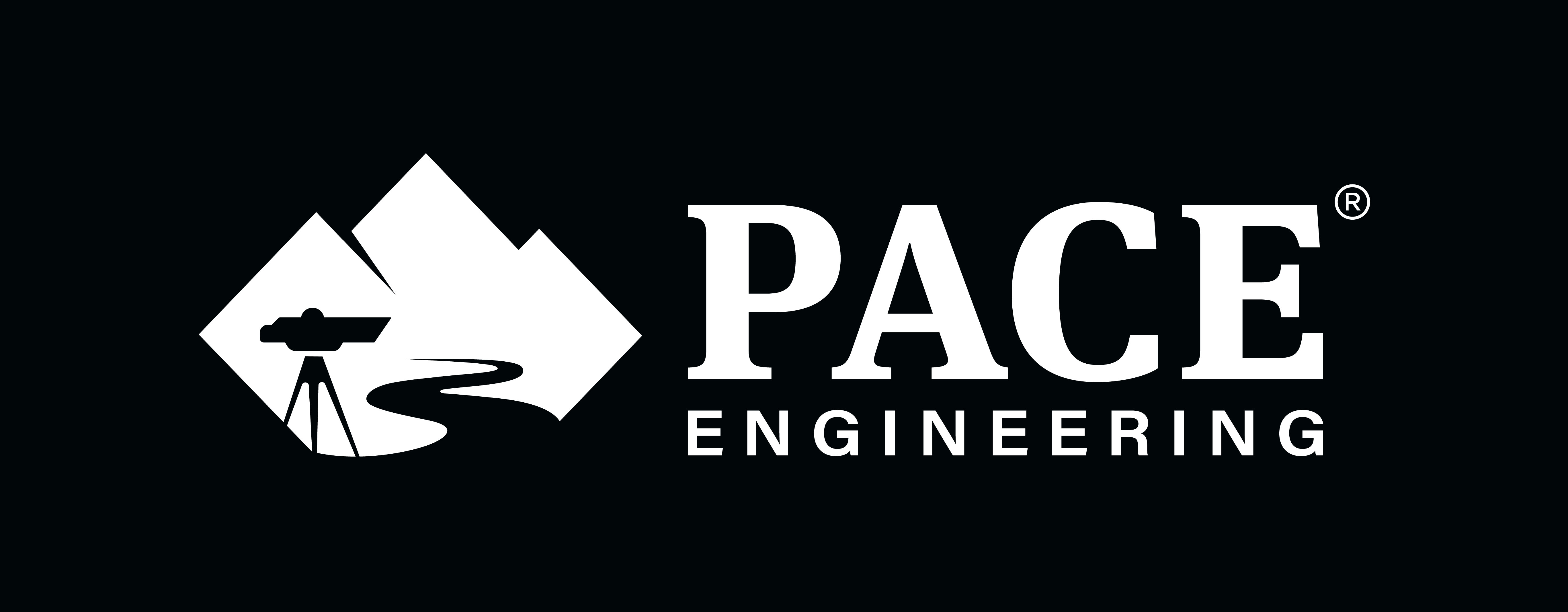
The PACE Engineering logo lockup reversed in white on near-black — a diamond containing a stylized river running between mountain peaks, beside the wordmark PACE in heavy capitals over ENGINEERING letterspaced beneath it The same lockup in full color on white — the diamond and the PACE wordmark in dark navy, with ENGINEERING letterspaced in teal

Homepage

Desktop — full page
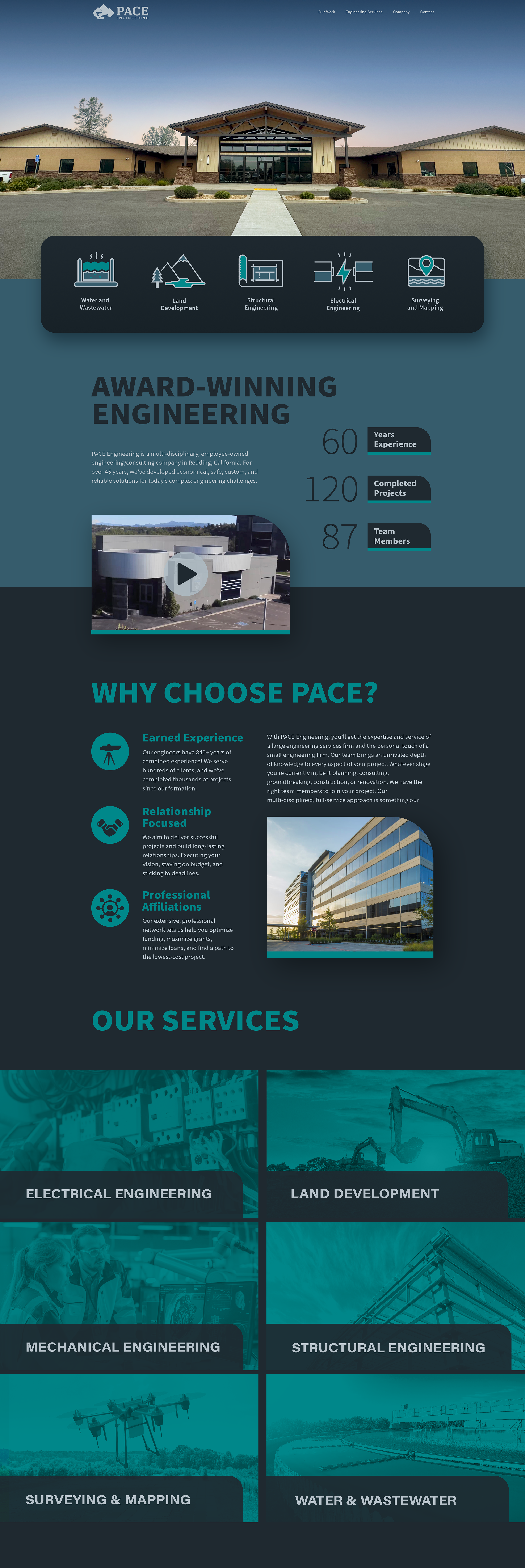
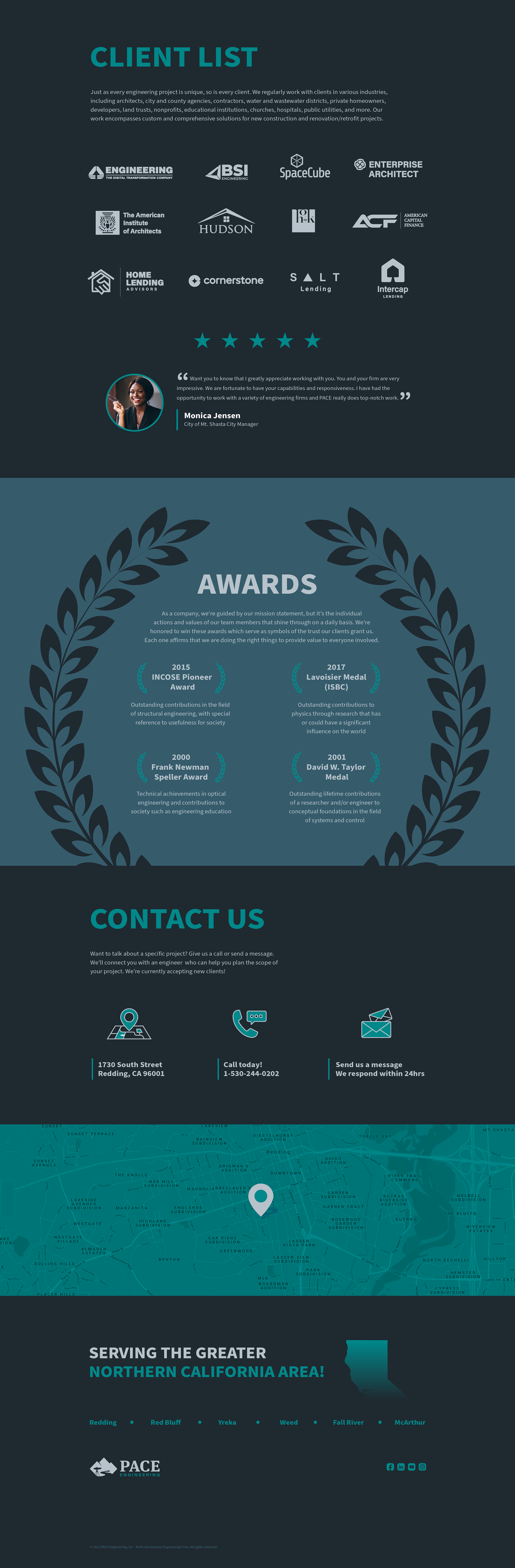
The PACE homepage, upper half: the headquarters building at dusk above five discipline icons, then AWARD-WINNING ENGINEERING with 60 years of experience, 120 completed projects and 87 team members, then WHY CHOOSE PACE? on earned experience, relationship focus and professional affiliations, then the OUR SERVICES grid of six teal duotone panels The PACE homepage, lower half: the CLIENT LIST of partner logos with a five-star client testimonial, the AWARDS panel setting four engineering honors inside a laurel wreath, CONTACT US with address, phone and message options, and the teal California map under SERVING THE GREATER NORTHERN CALIFORNIA AREA

Mobile

Every screen
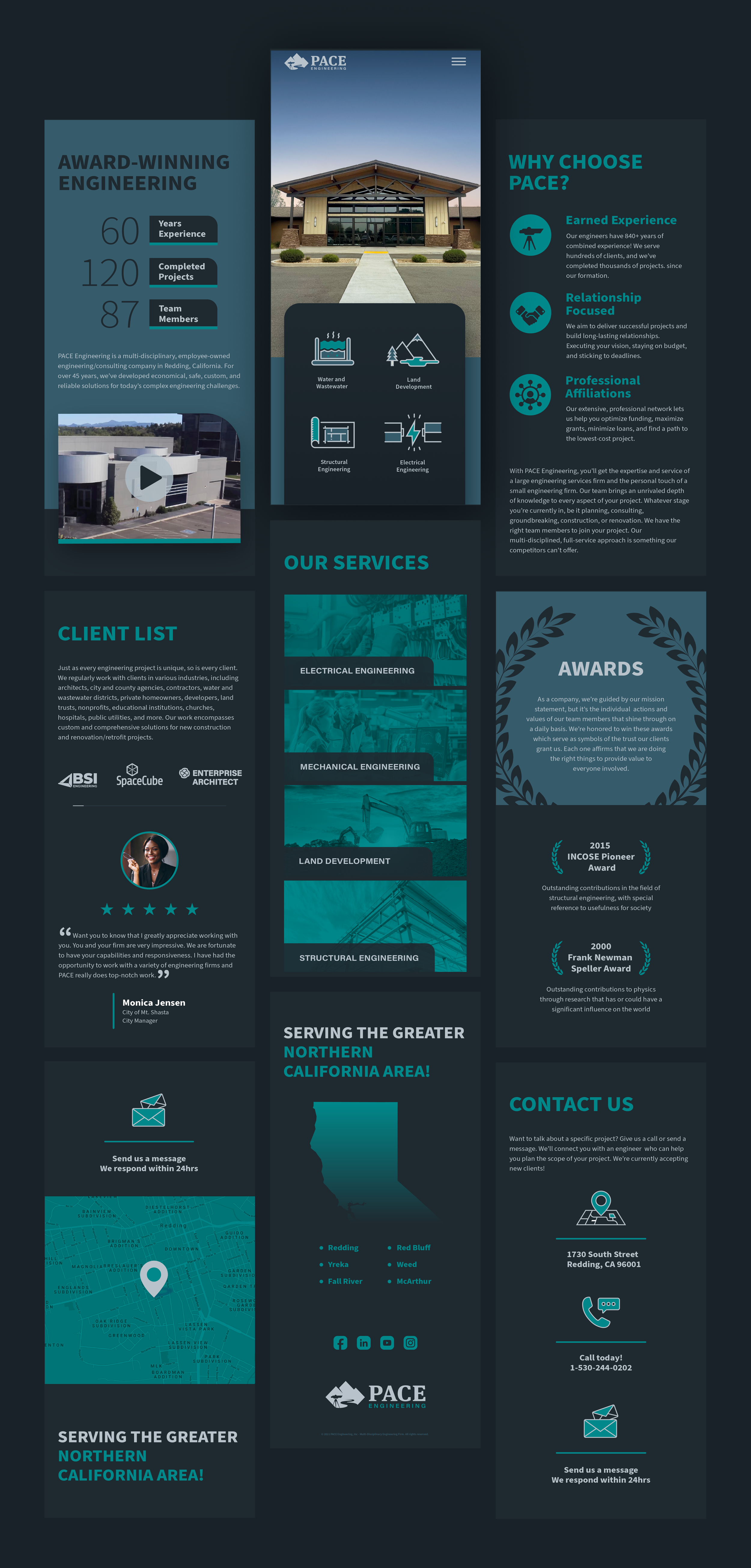
The PACE mobile design laid out as three columns of screens: the building hero with its four discipline tiles, AWARD-WINNING ENGINEERING with the statistics and a video panel, the OUR SERVICES stack, WHY CHOOSE PACE?, the CLIENT LIST and testimonial, the AWARDS wreath, CONTACT US and the teal service-area map

Stationery

Letterhead, folder, cards, hard hat
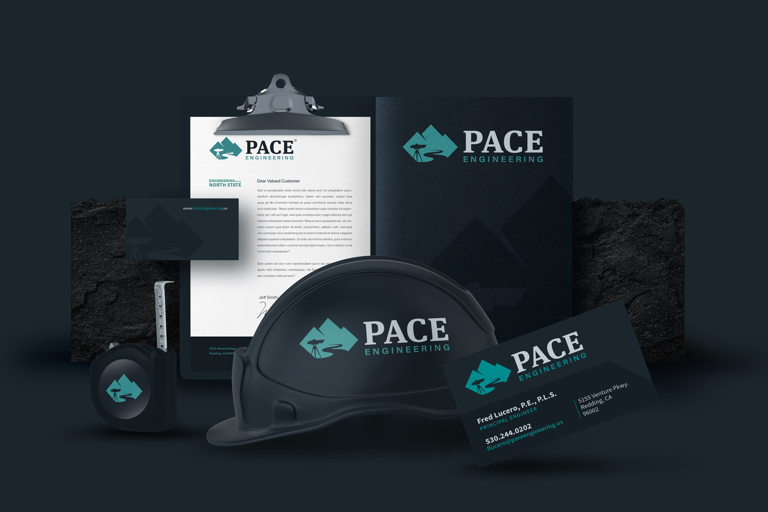
The PACE stationery set arranged on dark stone — letterhead on a clipboard, a presentation folder, business cards and a branded hard hat, all carrying the teal and navy mark

Apparel

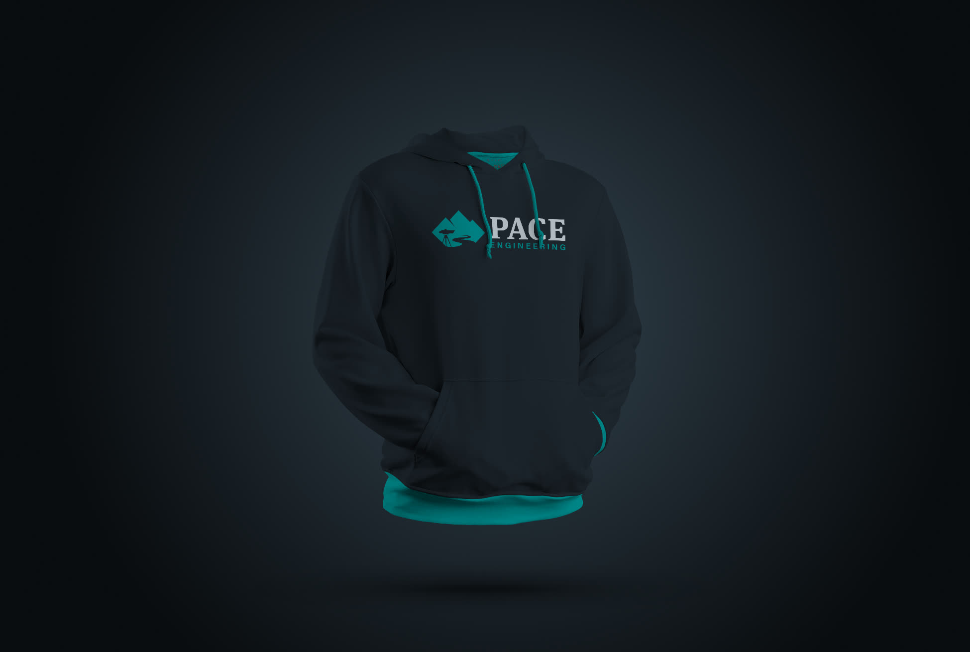
Branded hoodie
A charcoal PACE Engineering hoodie with a teal lining, the logo embroidered across the chest

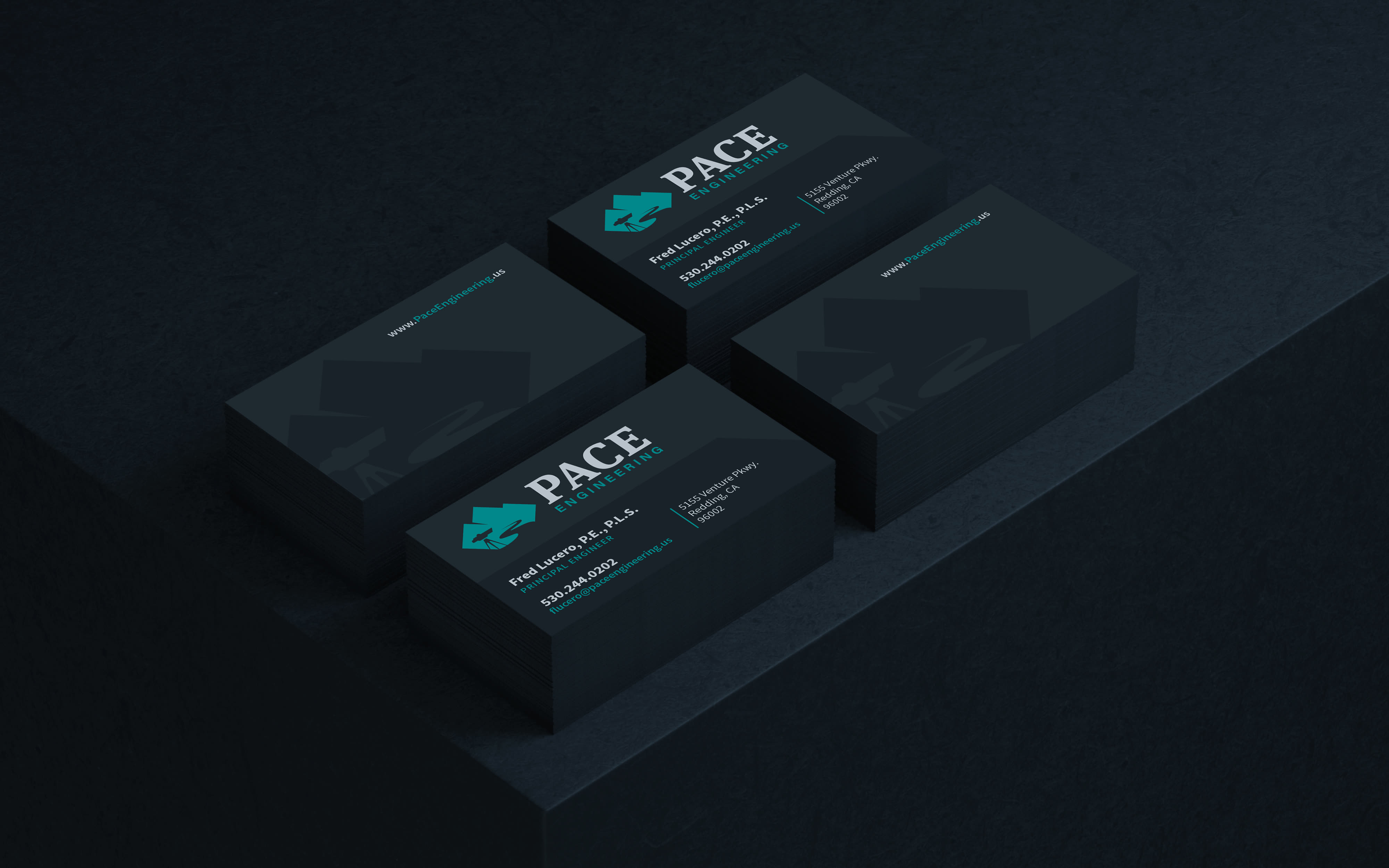
Business Cards

Two-sided, spot teal
Two stacks of PACE business cards on a near-black surface, the front face carrying the teal mountain-and-river mark beside the wordmark, the reverse left almost black

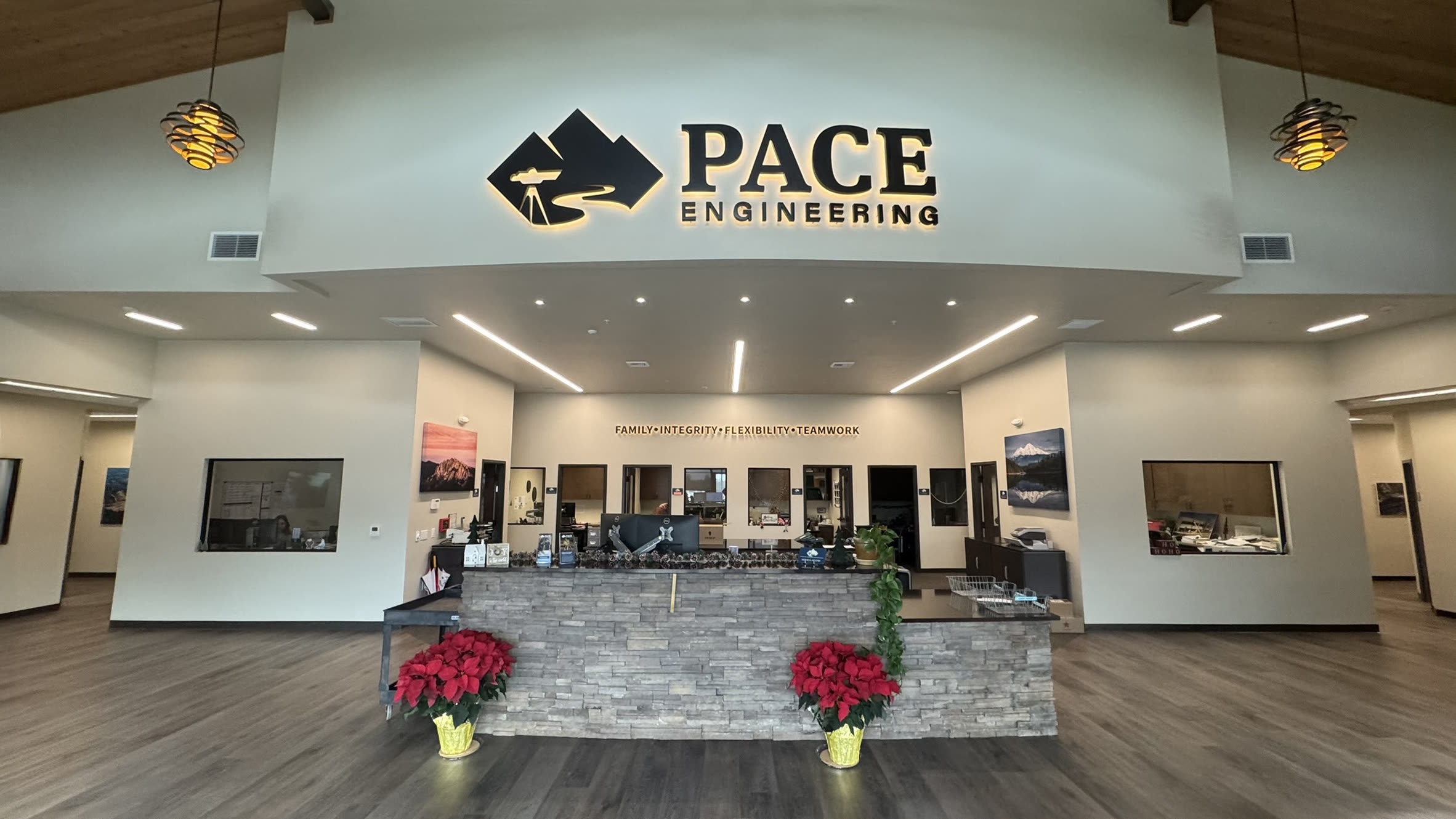
Reception

Interior signage, fabricated
The PACE Engineering reception — the dimensional mark and wordmark mounted above a stone-clad front desk between pendant lights, with framed project photography down the side wall

Monument Sign

Exterior signage, fabricated
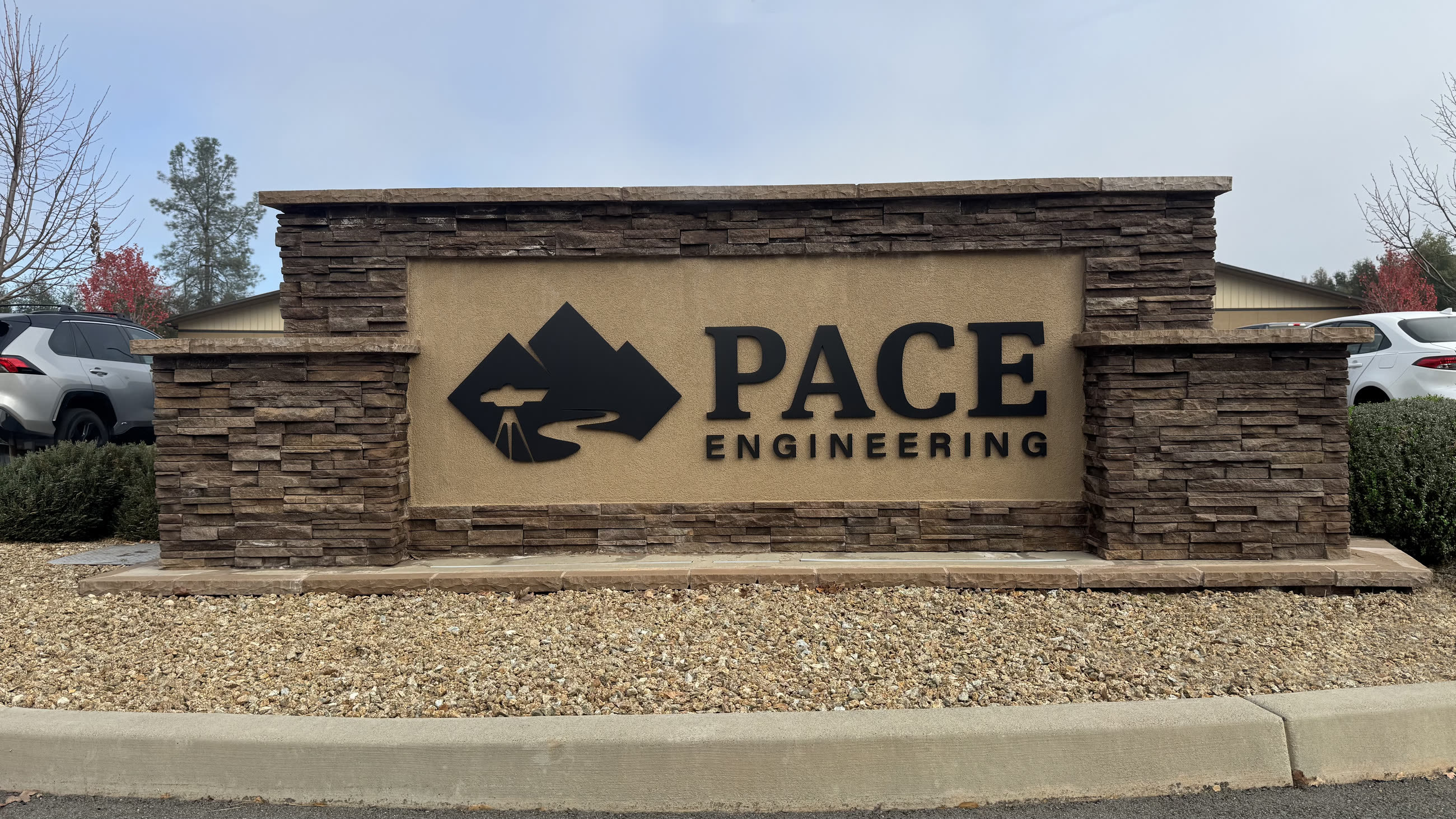
The PACE Engineering monument sign at the entrance to the campus — the mark and wordmark on a cream panel set into a stacked-stone plinth, in daylight